Before 2008 AIGA Medalist Gail Anderson was Art Director for Rolling Stone or a designer for the Boston Globe or Vintage Books at Random House, she was a soon-to-be graduate of SVA in search of her first job outside of school. Back in the mid-1980s, her design work was still just a collection of student projects, mostly from Paula Scher’s classes, compiled together loosely in a portfolio case. “Mounting projects on giant black boards was no longer in style,” Anderson recalls. “My work was earnest but playful, so Paula had me make an EF Hutton annual report so I’d be able to show that I could do ‘serious’ design, too.” When Scher arranged for Anderson to meet with Judy Loeser, the Art Director at Vintage Books at Random House, Anderson spent the weekend before the interview at a friend’s house creating two book covers to present since she didn’t have any in her portfolio. She got the job.
For students and recent graduates, this stress and scramble may sound painfully familiar. But take comfort in knowing that if Gail Anderson also experienced it, you’re part of a long legacy of designers who have had to figure out how to juggle making work and presenting work with the prospect getting work—workwork, a job!—and came out on the other side just fine. More than fine, in fact.
This week, as AIGA Portfolio Festival offer students and recent grads some guidance for refreshing their own portfolios in preparation for interviews and client pitches, we thought it would be fun to take a look back at how famous designers first got their footing. Everyone has to start out somewhere, and designers have a particular knack for finding creative ways to present work and to self-promote. Here, we look at how designers like Milton Glaser, Seymour Chwast, Aaron Douglas, Susan Kare, and Fortunato Depero showed off their early work.
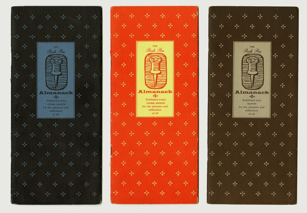
The Push Pin Almanac
Push-Pin Studios has a long history of self-initiated projects, with their experimental publication Push Pin Graphicrunning for 86 issues over 23 years. But prior to establishing Push-Pin Studios, designers Seymour Chwast, Edward Sorel, Reynold Ruffins, and later Milton Glaser developed a self-promotional monthly mailer called the Push Pin Almanack.Alexander Tochilovsky, Curator at Herb Lubalin Study Center of Design and Typography says, “the Almanack acted as an ingenious portfolio for the young designers, and generated enough visibility and work to allow them to quit their day jobs and to adopt the name of the Almanack as their studio’s name.”
Tochilovsky has writtenextensively about the history of the Almanack, explaining that the recent grads funded the publication by bartering with printers and typesetters in exchange for free ad space, which gave the designers yet another opportunity to create more illustrations in the densely packed booklet. “The lesson from all this is that if you want to make a certain type of work don’t let practicalities stand in the way,” writes Tochilovsky. “Find a way to do it. Be inventive. Be clever. Figure out how to take advantage of the limitations—Push Pin and their Almanack certainly did.”
Susan Kare’s Hallmark Illustrations
Susan Kare is best known for her work as “Mackintosh Artist” at Apple, creating the company’s first icons and proportionally spaced digital font family. But before revolutionizing computer interfaces, Kare had moved from New York to the Bay area with a PhD in fine art in hopes of securing a job at a creative agency. Without any previous experience in design or tech, she quickly put together a portfolio that included a book of greeting cards she could present at an interview with her dream company, Hallmark. Kare describes her early portfolio in an interview with Eye on Designfrom 2018:
“I still have several examples of cards that I mocked up using Rapidograph pens, watercolor, Letraset type, and a bit of collage. Of course I hoped a job would result, but (as my grandmother used to say) if it was ‘meant to be,’ it would have happened…Most of these cards use a bit of humor, and personification, and were intended to demonstrate an ability to work in various styles. Probably the happy Macintosh is a logical extension of my tendency to put smiles and faces on almost everything.”
Fortunato Depero’s the Bolted Book
First published in 1927, Italian futurist Fortunato Depero created Depero Futurista, or the Bolted Book, a 240 page monograph containing a sweeping collection of the designer’s work that included paintings, architectural designs, typography, advertisements, wordplay, and written manifestos. The pages, which could be removed and rearranged, were held together by two large metal bolts. The interactive nature of the binding made the monograph more than just a portfolio. “He was creating a book as machine,” says design critic Steven Heller in an interview with Wired that discusses the 2017 reprint of the book on which Heller consulted. Included in the facsimile is an essay by Depero championing the merit of self-promotion, writing it is, “not a vain, futile, or exaggerated expression of megalomania. It is instead the irrepressible need to let the public know, and fast, of one’s creations and ideas.”
Aaron Douglas’s early design covers
2018 AIGA Medalist Aaron Douglas was a prolific designer, illustrator, and educator of the early 20th century. He was a leading creative force in the Harlem Renaissance, and founded the Fisk University Art department while serving as director for 29 years. And yet his contributions to the field of design are not widely recognized today. Designer and educator Silas Munro is working to change that in his forthcoming book Major / Minor Design History: Expanded Lineages of Graphic Design. “I’m hoping my research including more lineages of BIPOC designers sheds light, opens up space, and speculates on new futures for more inclusive design disciplines,” he says.
Douglas moved to New York in 1925 and worked as an apprentice for German artist and designer Winold Reiss. Munro says one of Douglas’ first design jobs was most likely assisting Reiss on The New Negro, a collection of essays from pioneering writers of the Harlem Renaissance; however, it was a series of dynamic magazine covers that allowed Douglas to showcase his distinctive style. These covers included Opportunity, an academic journal published by the National Urban League, The Crisis, the NAACP’s publication, and Wallace Thurman’s magazine FIRE!! which only ran for one issue. His AIGA Medalist biography explains that his visual aesthetic, “evolved from deeply held beliefs combined with wide-ranging influences and disparate sources. He synthesized cubism, modernism, early art deco, traditional Egyptian imagery, and other African themes to create an artistic language that was meaningful and new.”


